promotional flowEmail #1 · Sent immediately
15% off inside 😍
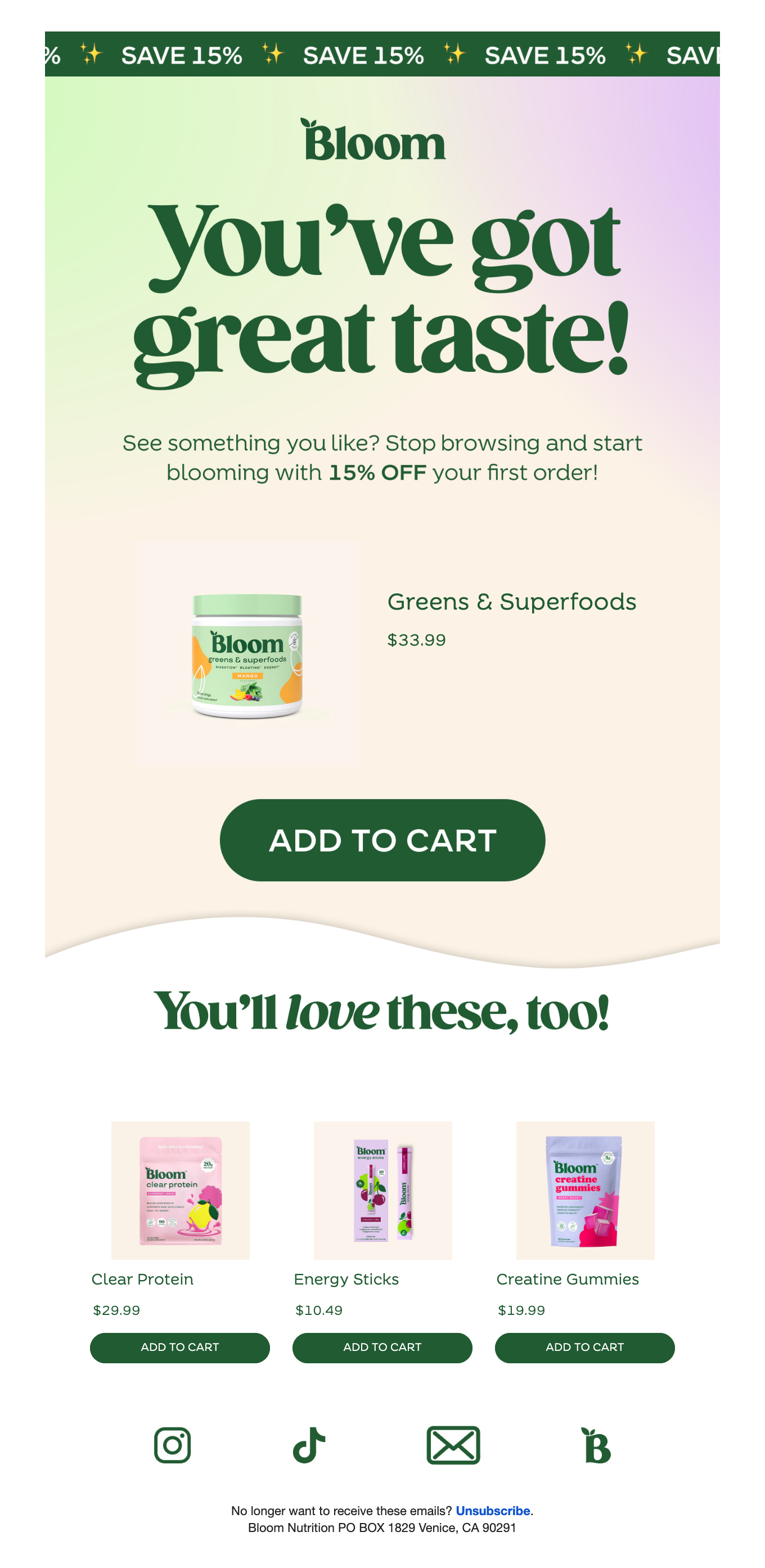
Email Analysis
# EMAIL ANALYSIS: Bloom Nutrition – First-Time Discount
═══ BRAND & STYLE OVERVIEW ═══
This is a vibrant, wellness-focused welcome email with a playful, modern aesthetic. The design uses a soft pastel gradient (mint green to lavender) as the hero backdrop, creating an inviting, youthful vibe. The brand prioritizes bold typography and product-focused merchandising. The color palette includes rich forest green (#2D5A47 or similar) for CTAs and text, soft pastels for backgrounds, and clean whites for sections. Typography pairs a strong serif headline font (likely a display serif with generous weight) with clean sans-serif body copy. The overall spacing is generous with clear visual hierarchy — plenty of breathing room between sections, but product grids are compact and efficient.
**Color Palette:**
- Forest Green: #2D5A47 (CTAs, text, brand accents)
- Mint Green: #C8E6C9 (hero gradient left side)
- Lavender/Pink: #E8D5F2 (hero gradient right side)
- Cream/Off-white: #F5F1E8 (body/product section backgrounds)
- White: #FFFFFF (text on dark, container fills)
- Gold/Yellow accent: implied in "SAVE 15%" banner
═══ PER-SECTION DETAILS ═══
**SECTION 1: Top Banner (Repeating Promo)**
**Layout & Alignment:**
- Full-width bar, horizontally scrolling/repeating pattern
- Text centered vertically within the banner
- Repeating text: "SAVE 15% ✨ SAVE 15% ✨ SAVE 15% ✨ SAV" (infinite scroll effect)
- Padding: ~8px top, ~8px bottom (compact banner height)
**Typography:**
- Font: Sans-serif, bold weight (700), ~14px
- Text color: White (#FFFFFF)
- Letter-spacing: 2–3px (loose, for emphasis)
- Text-transform: UPPERCASE
- Text alignment: Center within repeating segments
**Colors:**
- Background: Forest green (#2D5A47)
- Text: White (#FFFFFF)
- Gold sparkle emoji (✨) as visual punctuation
---
**SECTION 2: Hero Section (Gradient + Headline)**
**Layout & Alignment:**
- Full-width background with diagonal wave/curve divider at bottom
- Content centered both horizontally and vertically
- Padding: ~160px top, ~50px bottom (ample breathing room)
- Wave divider: cream/off-white with subtle shadow
**Typography:**
- Logo: "Bloom" — serif, ~28px, weight 700, forest green (#2D5A47)
- Main headline: "you've got great taste!" — serif display font, bold (700–800), ~48–56px
- Subheadline: "See something you like? Stop browsing and start blooming with **15% OFF** your first order!"
- Font: Sans-serif, regular weight (400), ~16px
- Text color: Forest green (#2D5A47)
- **Text emphasis:** "15% OFF" in bold (700)
- Line-height: ~1.5 (readable)
- Text alignment: Center
**Colors:**
- Background: Gradient from mint green (#C8E6C9) on left to lavender (#E8D5F2) on right
- Text: Forest green (#2D5A47)
---
**SECTION 3: Featured Product Section**
**Layout & Alignment:**
- Single product spotlight with wavy top divider
- Product image left-aligned (thumbnail, ~140px square)
- Product details (name + price) to the right of image
- Button centered below product area
- Padding: ~40px top, ~60px bottom
**Content Structure:**
- Product image: "Greens & Superfoods" jar (cream label with green lid) — ~130x130px
- Product name: "Greens & Superfoods" — sans-serif, 18px, weight 600, forest green (#2D5A47)
- Price: "$33.99" — sans-serif, 18px, weight 700, forest green (#2D5A47)
**Button:**
- Text: "ADD TO CART"
- Shape: Fully rounded pill (border-radius: 50px+)
- Background: Forest green (#2D5A47)
- Text color: White (#FFFFFF)
- Padding: ~16px top/bottom, ~48px left/right
- Font: Sans-serif, 700, ~14px, letter-spacing: 1px
- Text-transform: UPPERCASE
- Width: ~280px (proportional to container)
**Colors:**
- Background: Cream (#F5F1E8)
---
**SECTION 4: Secondary Headline (Bridge)**
**Layout & Alignment:**
- Centered, minimal padding (~24px top, ~24px bottom)
- Positioned between featured and grid product sections
**Typography:**
- Text: "You'll **love** these, too!"
- Font: Serif display font, ~36–40px, weight 700
- Word "love" in italics for emphasis
- Text color: Forest green (#2D5A47)
- Text alignment: Center
**Colors:**
- Background: Cream (#F5F1E8)
---
**SECTION 5: Product Grid (3 Columns)**
**Layout & Alignment:**
- 3-column equal-width grid
- Each tile: product image (top), name (below), price (below name), CTA button (bottom)
- Gap between columns: ~16–20px
- Padding: ~0px top, ~60px bottom (products bleed to section edge, ample bottom breathing room)
- Each tile is center-aligned internally
**Product Tiles (Repeat × 3):**
**Tile 1: Clear Protein**
- Image: Pink/orange product packaging (~100x120px)
- Name: "Clear Protein" — sans-serif, 14px, weight 600, forest green (#2D5A47)
- Price: "$29.99" — sans-serif, 14px, weight 700, forest green (#2D5A47)
- Button: "ADD TO CART" — same pill style as above, ~240px wide
**Tile 2: Energy Sticks**
- Image: Purple multi-stick packaging (~100x120px)
- Name: "Energy Sticks" — sans-serif, 14px, weight 600, forest green (#2D5A47)
- Price: "$10.49" — sans-serif, 14px, weight 700, forest green (#2D5A47)
- Button: "ADD TO CART"
**Tile 3: Creatine Gummies**
- Image: Blue/pink gummy pouch (~100x120px)
- Name: "Creatine Gummies" — sans-serif, 14px, weight 600, forest green (#2D5A47)
- Price: "$19.99" — sans-serif, 14px, weight 700, forest green (#2D5A47)
- Button: "ADD TO CART"
**Colors:**
- Background: Cream (#F5F1E8)
- All text: Forest green (#2D5A47)
---
**SECTION 6: Social & Footer**
**Layout & Alignment:**
- Centered vertically and horizontally
- Flex row layout with equal spacing between icons
- Padding: ~40px top, ~40px bottom
**Social Icons:**
- Instagram, TikTok, Email, Bloom website (B logo)
- Each icon: ~32px square, forest green (#2D5A47) outline/stroke
- Icon spacing: ~24px between each
**Footer Copy:**
- Text: "No longer want to receive these emails? **Unsubscribe.** Bloom Nutrition PO BOX 1829 Venice, CA 90291"
- Font: Sans-serif, 11px, weight 400
- Text color: Dark gray/charcoal (#333333 or #2D2D2D)
- Text alignment: Center
- Line-height: 1.6 (slightly loose for readability at small size)
- "Unsubscribe" is underlined and clickable (link color: forest green)
**Colors:**
- Background: White (#FFFFFF) or very light gray (#FAFAFA)
---
═══ CRITICAL: HEIGHT & SCALE ═══
- **Email width:** 600px (fixed)
- **Banner section:** ~24px tall (8px padding × 2)
- **Hero section:** ~360px tall (~160px top padding + 140px content height + 50px bottom padding + wave divider)
- **Featured product:** ~320px tall (~40px top + 140px product/button area + 60px bottom + wave divider)
- **Bridge headline:** ~72px tall (~24px padding × 2 + ~24px text height)
- **Product grid:** ~280px tall (~0px top + 120px tile height + ~60px bottom + button area)
- **Footer:** ~120px tall (~40px padding × 2 + ~40px content)
**Total email length: ~1,500–1,600px**
═══ COPY CONTENT ═══
**[Top Banner]**
"SAVE 15% ✨ SAVE 15% ✨ SAVE 15% ✨ SAV" (repeating)
**[Hero Section]**
- Logo: "Bloom"
- Headline: "you've got great taste!"
- Subheadline: "See something you like? Stop browsing and start blooming with 15% OFF your first order!"
**[Featured Product]**
- Name: "Greens & Superfoods"
- Price: "$33.99"
- Button: "ADD TO CART"
**[Bridge Headline]**
"You'll love these, too!"
**[Product Grid - Tile 1]**
- Name: "Clear Protein"
- Price: "$29.99"
- Button: "ADD TO CART"
**[Product Grid - Tile 2]**
- Name: "Energy Sticks"
- Price: "$10.49"
- Button: "ADD TO CART"
**[Product Grid - Tile 3]**
- Name: "Creatine Gummies"
- Price: "$19.99"
- Button: "ADD TO CART"
**[Footer]**
"No longer want to receive these emails? Unsubscribe. Bloom Nutrition PO BOX 1829 Venice, CA 90291"
---
═══ STRATEGY NOTES ═══
**Email Type:** First-time buyer / Welcome discount email (Position #1 in a flow)
**Primary Conversion Goal:** Drive first purchase with a 15% discount incentive; secondary goal is to build awareness of best-selling or complementary products.
**Offer Details:**
- **Discount:** 15% off first order
- **Urgency:** Implied urgency ("Stop browsing and start blooming") but no explicit deadline stated in email
- **Product Focus:** 1 featured hero product + 3 related product recommendations in a grid
**Notable Persuasion Tactics:**
1. **Positive Affirmation:** "You've got great taste!" — builds emotional connection and reduces buyer hesitation
2. **Repeating Banner:** "SAVE 15%" banner creates visual urgency and reinforces the discount throughout
3. **Product Diversity:** 4 distinct products shown (powder, sticks, gummies, protein) — appeals to different use cases
4. **Social Proof (Implied):** "You'll love these, too!" — suggests these are popular/bestselling items
5. **Clear CTAs:** Prominent pill-shaped buttons with UPPERCASE text make action frictionless
6. **Gradient Hero:** Soft pastel gradient creates a welcoming, premium aesthetic that appeals to wellness-conscious consumers
7. **Product Pricing Transparency:** All prices visible immediately, removing hesitation
**What Makes This Email Effective:**
- **Clean Visual Hierarchy:** Eyes naturally flow from banner → headline → featured product → grid → footer
- **Product-Centric Design:** This is a catalog email masquerading as a welcome email — it prioritizes conversion over storytelling
- **Mobile-Friendly Grid:** 3-column layout scales well; buttons are large and tappable
- **Brand Personality:** The serif headline font + soft color palette position Bloom as premium/aspirational yet approachable
- **Low Friction:** Multiple entry points (4 products, 4 "ADD TO CART" buttons) increase likelihood of at least one conversion
- **Wave Dividers:** Subtle design element (the curves between sections) add visual interest without overwhelming
**Why This Email Will Convert:**
This email uses a proven welcome sequence template: social proof + discount offer + curated product recommendations + clear CTAs. The 15% discount is strong enough to motivate purchase, and the product selection (greens, protein, energy, creatine) suggests this is a fitness/wellness brand targeting an engaged audience likely to convert. The gradient hero and playful copy ("you've got great taste!") build brand affinity before asking for the sale.