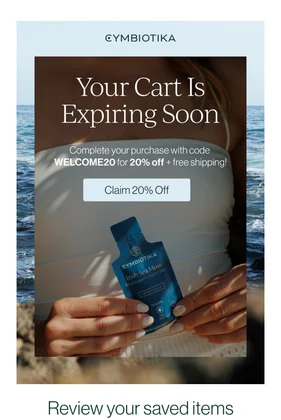
abandoned cart flowEmail #1 · Sent immediately
We saved your items 🤍
Email Analysis
# EMAIL ANALYSIS: GYMBIOTIKA ABANDONED CART
## BRAND & STYLE OVERVIEW
Gymbiotika's email presents a **premium wellness brand** with a **clean, modern aesthetic** that balances sophistication with approachability. The design uses a serene **muted color palette** dominated by soft blues, deep teals, and cream tones—evoking calm, health, and natural wellness. The brand conveys trust through intentional typography and spacious layouts. Typography pairs a **classic serif headline font** (likely a transitional serif for the main hero) with **clean sans-serif body copy**, creating a sophisticated yet accessible feel. The overall spacing philosophy is **generous and airy**, with significant whitespace between sections that encourages focus and readability—appropriate for a wellness brand emphasizing mindfulness.
**Color Palette:**
- Background (hero): `#8FA3B8` (soft slate blue)
- Background (feature section): `#1B4D3E` (deep forest teal)
- Accent (banner): `#F4E4C1` (pale butter yellow)
- Text (primary): `#FFFFFF` (white on dark), `#2D3436` (charcoal on light)
- Text (link): `#0066CC` (bright blue)
- Button: `#1B4D3E` (matching teal)
**Font Pairing:**
- Headlines: Serif (transitional style, likely Georgia or similar)—elegant, ~36–48px
- Body: Sans-serif (likely Helvetica Neue or similar)—clean, ~14–16px
## SECTION-BY-SECTION BREAKDOWN
---
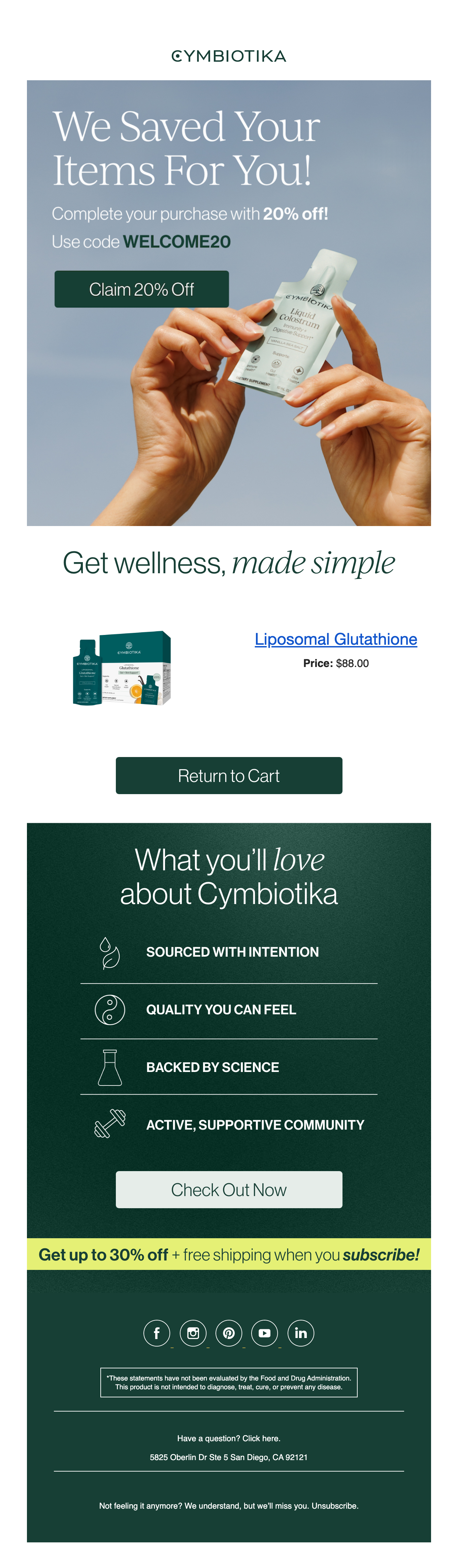
### **1. Header / Logo**
**Layout & Alignment:**
- Centered horizontally at 600px width
- Minimal top padding (~20px), minimal bottom padding (~16px)
**Typography:**
- Font: Sans-serif, uppercase
- Size: ~14px, weight 600, letter-spacing 2px
- Text alignment: centered
- Color: `#2D3436` (charcoal)
**Colors:**
- Background: `#FFFFFF` (white)
**Copy:**
- "GYMBIOTIKA"
---
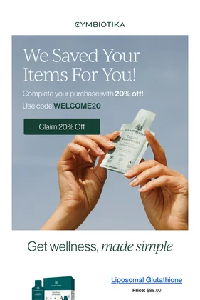
### **2. Hero Section (Abandoned Cart Promo)**
**Layout & Alignment:**
- Full-width container, centered content
- Padding: ~40px top, ~40px bottom, ~32px left/right
- Content: centered horizontally and vertically
- The section uses a split layout: **text on left, product image (hands holding bottle) on right**—approximately 50/50 column split
**Typography:**
*Main Headline:*
- Font: Serif (transitional)
- Size: ~44px, weight 400 (light), line-height 1.2
- Color: `#FFFFFF`
- Text alignment: left-aligned within text area
- Copy: "We Saved Your Items For You!"
*Subheading:*
- Font: Sans-serif
- Size: ~16px, weight 400
- Color: `#FFFFFF`
- Copy: "Complete your purchase with **20% off!**" (bold applied to "20% off")
*Code Line:*
- Font: Sans-serif
- Size: ~14px
- Color: `#FFFFFF`
- Copy: "Use code **WELCOME20**" (WELCOME20 in bold/weight 700)
**Colors:**
- Background: `#8FA3B8` (soft slate blue)
- Text: `#FFFFFF` (white)
**Button:**
- Shape: Rounded rectangle (~4px border-radius)
- Background: `#1B4D3E` (forest teal)
- Text: `#FFFFFF` (white), ~16px, weight 600
- Padding: ~12px top/bottom, ~24px left/right
- Text alignment: centered
- Copy: "Claim 20% Off"
**Background Image:**
- Product image: hands (skin tone) holding a Gymbiotika product bottle (white/cream label on clear bottle)
- Positioned on right side of section, occupying ~45% of width
- Placeholder dominant colors: cream, clear, skin tone
---
### **3. Tagline Section**
**Layout & Alignment:**
- Centered horizontally
- Padding: ~40px top, ~40px bottom
- Single-line, centered text
**Typography:**
- Font: Serif (transitional)
- Size: ~32px, weight 400
- Color: `#2D3436` (charcoal)
- Text alignment: centered
- Copy: "Get wellness, *made simple*" (made simple in italics)
**Colors:**
- Background: `#FFFFFF` (white)
---
### **4. Product Display Section**
**Layout & Alignment:**
- Padding: ~32px top, ~32px bottom, ~32px left/right
- Two-column layout: product image (left ~35%), product info (right ~65%), gap ~24px
- Vertically aligned to center
**Typography:**
*Product Name/Title:*
- Font: Sans-serif
- Size: ~16px, weight 700, color `#0066CC` (blue, underlined as link)
- Copy: "Liposomal Glutathione"
*Price:*
- Font: Sans-serif
- Size: ~14px, weight 400, color `#2D3436`
- Copy: "Price: $88.00"
**Colors:**
- Background: `#FFFFFF` (white)
**Product Image Placeholder:**
- Approximate dimensions: ~120px width
- Dominant colors: teal/dark green, white, cream (product packaging)
---
### **5. CTA Button (Return to Cart)**
**Layout & Alignment:**
- Full-width container with ~32px left/right padding
- Padding: ~16px top, ~16px bottom
- Button itself: 100% width of container (minus padding)
**Button Styling:**
- Shape: Rounded rectangle (~4px border-radius)
- Background: `#1B4D3E` (forest teal)
- Text: `#FFFFFF` (white), ~16px, weight 600
- Padding: ~16px top/bottom
- Text alignment: centered
- Copy: "Return to Cart"
**Colors:**
- Section background: `#FFFFFF` (white)
---
### **6. Feature Section (Brand Promise)**
**Layout & Alignment:**
- Full-width, padding: ~40px top, ~40px bottom, ~32px left/right
- Centered content
- 4 icon-text rows, stacked vertically
- Each row: icon (left, ~24px width) + text (right), left-aligned within section
**Typography:**
*Headline:*
- Font: Serif
- Size: ~32px, weight 400
- Color: `#FFFFFF`
- Copy: "What you'll **love** about Cymbiotika" (love in italics)
- Text alignment: centered
*Feature Labels:*
- Font: Sans-serif
- Size: ~13px, weight 700, letter-spacing 1.5px
- Color: `#FFFFFF`
- Text-transform: UPPERCASE
- Spacing between label and icon: ~12px
**Feature Copy:**
- Row 1: "SOURCED WITH INTENTION" (icon: leaf outline)
- Row 2: "QUALITY YOU CAN FEEL" (icon: yin-yang outline)
- Row 3: "BACKED BY SCIENCE" (icon: beaker outline)
- Row 4: "ACTIVE, SUPPORTIVE COMMUNITY" (icon: hands/support outline)
**Colors:**
- Background: `#1B4D3E` (forest teal)
- Text: `#FFFFFF`
- Icons: `#FFFFFF` (outline stroke)
- Dividing lines between rows: `#FFFFFF`, ~1px opacity ~0.3
**Proportions:**
- Each feature row: ~60px height (icon + text)
- Gap between rows: ~12px
---
### **7. Feature CTA Button**
**Layout & Alignment:**
- Padding: ~32px top, ~32px bottom within feature section
- Centered horizontally
- Button width: ~240px (constrained, not full-width)
**Button Styling:**
- Shape: Rounded rectangle (~4px)
- Background: `#FFFFFF` (white)
- Text: `#1B4D3E` (forest teal), ~16px, weight 600
- Padding: ~16px top/bottom, ~32px left/right
- Text alignment: centered
- Copy: "Check Out Now"
---
### **8. Subscription Banner**
**Layout & Alignment:**
- Full-width, padding: ~16px top, ~16px bottom, ~32px left/right
- Text: centered
**Typography:**
- Font: Sans-serif
- Size: ~14px, weight 700
- Color: `#1B4D3E` (forest teal text on yellow background)
- Text-transform: None (mixed case)
- Copy: "Get up to 30% off + free shipping when you **subscribe!**" (subscribe italicized)
**Colors:**
- Background: `#F4E4C1` (pale butter yellow)
- Text: `#1B4D3E`
---
### **9. Social Links**
**Layout & Alignment:**
- Padding: ~32px top, ~24px bottom
- Centered horizontally
- 5 icon links in a row, equally spaced
**Typography:**
- Icons only (no text labels)
- Size: ~32px diameter circles
**Button/Icon Styling:**
- Shape: Circle (`border-radius: 50%`)
- Background: transparent / border only
- Border: `#FFFFFF`, ~1–2px stroke
- Icon color: `#FFFFFF`
- Padding: ~8px inside circle (for spacing)
- Icons (left to right): Facebook, Instagram, Pinterest, YouTube, LinkedIn
**Colors:**
- Background: `#1B4D3E` (forest teal)
- Icon color: `#FFFFFF`
---
### **10. Disclaimer / Legal Text**
**Layout & Alignment:**
- Padding: ~24px top, ~24px bottom, ~32px left/right
- Left-aligned
- Full width, with border-top accent
**Typography:**
- Font: Sans-serif
- Size: ~11px, weight 400
- Color: `#FFFFFF`
- Line-height: 1.5 (loose for readability)
- Text alignment: left
**Colors:**
- Background: `#1B4D3E` (forest teal)
- Text: `#FFFFFF`
- Border (top): `#FFFFFF`, ~1px, opacity ~0.2
**Copy:**
"*These statements have not been evaluated by the Food and Drug Administration. This product is not intended to diagnose, treat, cure, or prevent any disease."
---
### **11. Footer Section**
**Layout & Alignment:**
- Padding: ~32px top, ~32px bottom, ~32px left/right
- Centered text
- Stacked vertically (3 separate lines)
**Typography:**
*Line 1:*
- Font: Sans-serif
- Size: ~13px, weight 400
- Color: `#FFFFFF`
- Copy: "Have a question? Click here."
- "Click here" is a blue hyperlink (`#0066CC`)
*Line 2:*
- Font: Sans-serif
- Size: ~12px, weight 400
- Color: `#FFFFFF`
- Copy: "5825 Oberin Dr Ste 5 San Diego, CA 92121"
*Line 3:*
- Font: Sans-serif
- Size: ~12px, weight 400
- Color: `#FFFFFF`
- Copy: "Not feeling it anymore? We understand, but we'll miss you. Unsubscribe."
- "Unsubscribe" is a hyperlink (`#0066CC`)
**Colors:**
- Background: `#1B4D3E` (forest teal)
- Text: `#FFFFFF`
- Links: `#0066CC`
---
## STRATEGY NOTES
**Email Type:** Abandoned Cart / Cart Recovery email with upsell
**Primary Conversion Goal:** Recover the abandoned cart by incentivizing checkout with a 20% discount code (WELCOME20)
**Discount/Offer Details:**
- 20% off code: **WELCOME20**
- Secondary offer: Up to 30% off + free shipping on subscription (teased in yellow banner)
**Notable Persuasion Tactics:**
1. **Urgency via personalization:** "We Saved Your Items For You!" creates a sense that the items are being held/waiting
2. **Social proof & brand trust:** Feature section highlighting "Backed by Science," "Quality You Can Feel," and "Active, Supportive Community" reduce purchase anxiety
3. **Clear product reinsertion:** Shows the exact product left behind (Liposomal Glutathione) with price and easy return-to-cart CTA
4. **Urgency + incentive:** Discount code prominently displayed with button to claim it
5. **Subscription upsell:** Secondary offer in contrasting yellow banner to increase lifetime value
6. **Community angle:** Wellness framing emphasizes active, supportive community—appeals to health-conscious lifestyle segment
**What Makes This Email Effective:**
- **Sophisticated design balanced with clarity:** High-end wellness aesthetic doesn't sacrifice scannability; CTA hierarchy is clear
- **Multi-layered conversion:** Primary (recover cart) + secondary (subscription) offers address different segments
- **Authentic brand voice:** Tagline "made simple" and community emphasis align with Gymbiotika's positioning
- **Trust-building brand promise:** Icon-led feature section immediately reassures recipient about product quality and sourcing before asking for money
- **Visual consistency:** Color palette and serif/sans-serif pairing maintain brand identity throughout